TGG and Touchline Analytics Tableau Masterclass
- Zack Killoran
- Nov 25, 2020
- 5 min read
As part of my analysis workflow, I like to take the large amounts of data that we collect into Tableau to assess how the teams, units and individuals are performing according to our KPI's. I find that this is a great way for myself to gain further insight, and it can make aesthetically appealing visualisations for coaches and players alike.
The Training Ground Guru hosted a Masterclass with Touchline Analytics' Tom Goodall. For me, this presented an excellent learning opportunity to see whether my own current workflows are efficient and if there are any golden nuggets of information that I could take away and apply to my own work.
Below are a number of visualisations that I created during the session, and have tried to refine further to improve the overall formatting of them, and ensure that the information being given is representative of the messages that we want to deliver.
Firstly, we made a match dashboard which displays data from a specific game, in this case Arsenal's win over West Ham early on in the Premier League season. On the right hand side, I am showing the top five players who played the most successful passes, and the top three for shots and crosses. Of course, these would be made bespoke to the needs of the club, but already we can gain some insight here. Arsenal dominate all top 5 spots for the number of completed passes, however these are three defenders and the base of midfield, likely low risk passes, also meaning low reward. Arsenal appear to have been lucky to come away with all three points; West Ham outperformed Arsenal in attacking statistics including xG, Successful Attacking Actions, Shots and Shots On Target.

From here, we can ask questions and delve deeper into several parts of both team's performance. One question might be why Arsenal are not having lots of shots, considering that they managed 23 touches in the opposition box for example. Looking at this data, it might be the lack of quality in the final ball, given a lowly 37% cross success. However, this could be down to the lack of support also, and so it is worth going back to the video to gain actionable insight here.
This dashboard can be changed using the match name filter to any game within the dataset.
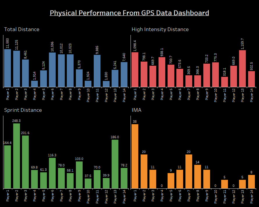
Next, we moved onto assessing physiological performance, using a dummy GPS datasheet.
Given that my degree has several modules focusing on physiology, this is an area in which I could support a Sport Scientist at a club, with good base knowledge to understand the metrics that they are interested in. A dashboard like this could be automated for each game or training session so that the Sport Science Department can constantly be aware of any potential injury risks and advise coaching staff of how to mitigate these. This could be done through more complex metrics also, for example the acute-chronic workload ratio.

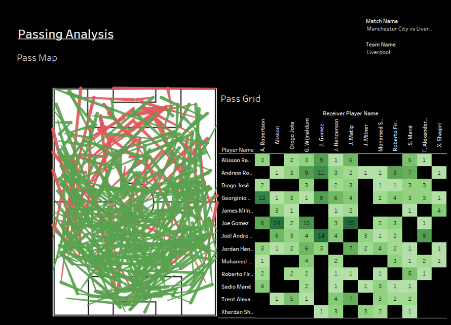
Now diving into event data, we made a dashboard related to passing. I think this is an improvement on the pass maps that I have previously made in R, replacing arrowheads with the thickness of the line to signify the pass end. Also, this makes a more actionable report that can be used with coaches to gain specific insights. This dashboard looks at all passes that Liverpool attempted when playing away to Manchester City earlier in the season. The pass grid on the right is something I have not done before. This shows the number of passes between individuals and is useful to see key relationships, similarly to how bridges in a passing network can. I have used the Pass Grid to be a filter, so when a relationship here is selected on the dashboard, only the passes relating to that are shown on the Pass Map.

Drilling down to a more specific pass type can give us more information onto how a team plays and what relationships are perhaps most important within the final third, for example. I have shown this in the visualisation below, looking at the passes that Mane played to Salah, that were received inside City's penalty box. As I have filtered the passes down to those received in City's box only, there is a drastic reduction in the number of passes and relationships within the Pass Grid.

Bespoke definitions that best fit within the club's philosophies could be made here to gain the most meaningful insights. These could be to do with the types of passes that are considered dangerous, or looking at certain areas of the pitch to assess if the build up play is matching what is being practised on the training ground.
Finally, the session moved onto creating different visualisations for shooting metrics. I have not put these images into a dashboard as I feel at this stage that they are most useful in isolation, or used at different points within the process. I think it would be more useful to supplement a dashboard with factors such as where are these shots being created from, how and who by, for example.
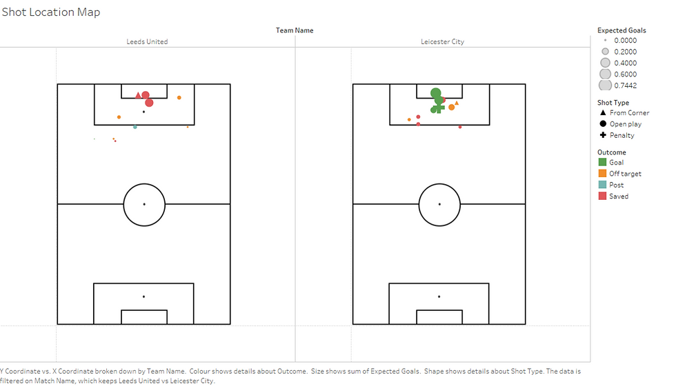
Again, this shot location map is similar to one that I have previously made in R. It shows all of the shots from Leeds vs Leicester, with xG dictating the size of each datapoint, where the shot originated from shown by the shape, and the shot outcome shown by colour. This would be useful for post-match analysis to give a simple message of where shots were being taken from and what type of possession had ended up in that shot. From here, it could be seen where one team may have been superior or possibly where a game plan had been particularly successful.

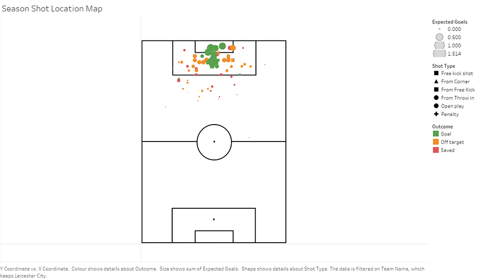
Moving on, the next visualisation shows Leicester's Shot Density Map across the season. This would be useful for both trend analysis and opposition scouting by assessing the key areas within the pitch that the team looks to score from. Again, this could be taken a step further by looking to filter down to a certain activity, for example by looking only at shots from corners, we might see where a team generally attacks from. That information would be useful for assessing what is the appropriate defensive organisation for a certain game.

The final visualisation is similar to the previous, showing data points for all of Leicester's shots from the season. It uses the same key as the first shooting map also. Looking at this, most of Leicester's success clearly comes in the central corridor of the penalty box. This is hardly ground breaking news, given how Vardy plays, and it seems as if most of the shots are coming from open play. Interestingly, there have not been many shots from free kicks outside of the box. By looking to the video, it may reveal that Leicester are much more likely to cross in their free kicks and so this may change how the team sets up to defend these. It is worth remembering the context here also, I would imagine that had Maddison been fit for the start of this season that this visualisation could be slightly different, so it is worth investigating how that might change as he returns to full fitness.

Overall, this was an excellent learning opportunity for myself and something that I am really pleased to have done. Thank you to those involved with the session for a great resource. I have lots of ideas about how I can use what I have learnt here and apply it to what I do, so am looking forward to seeing where this takes me.


Comments